By Álvaro Pin
A 3D Tool for Companies, Not Just Designers.
3D Style Guides may be new, but the concept itself isn’t. They follow the same rationale as Brand Style Guides: they provide all the information needed on how to style a garment digitally. It’s a document that ensures everyone follows the same principles when styling garments in 3D. This is a critical piece for scaling 3D samples across your company as it helps standardize and define your styling criteria across the entire collection.
These documents can help product creation teams bring everyone together and define what a garment should look like in 3D. One common challenge Digital Product Creation (DPC) teams face is dealing with objections from Sales on using 3D samples. Collaborating with Sales to create the perfect 3D Style Guide can smoothen this obstacle, making the process open, transparent, and accountable for every team involved. Ultimately, 3D Style Guides should be treated as a company tool, not a design tool.
3D Style Guides shouldn’t focus on the technical details. In contrast to a render requirements document, which provides guidelines on rendering garments (including technical elements such as quality, resolution, maps, or lighting) a 3D Style Guide documents how a product needs to be styled when presented in 3D. Sure, there may be technical considerations implied, but 3D Style Guides should focus on how to present each product to facilitate the use of those assets across your organization.

Who’s responsible for creating a 3D Style Guide?
3D Style Guides need to be co-created with every team that uses or will use 3D samples. Each team offers a different perspective, sharing all possible use cases, which help those responsible for creating the 3D sample build a pipeline that can cover their needs without duplicating or overlapping work. Let’s see who’s involved in making Style Guides and the role they play in creating them.
- Designers. They are often responsible for creating the 3D sample, which means they need everyone’s feedback to ensure their output meets the various needs of other teams.
- Vendors. In many companies, vendors are responsible for creating the final 3D sample. They need to be involved in the process to ensure everything is clear for them, in order to avoid unnecessary feedback and revision rounds.
- Merchandisers. They usually sign off products at different stages of the calendar, usually involving physical prototypes.
- Sales. They are a critical actor in 3D Style Guides as their feedback and involvement enable companies to expand the use of 3D beyond design into commercial channels.

Why are 3D Style Guides important?
- Connect product creation with other disciplines. Many go-to-market calendars are linear, forcing teams to work in sequential order (one after the other) instead of collaborating and iterating through feedback. 3D Style Guides need to be signed off across teams, helping product creation teams connect with teams they wouldn’t always work with (like Marketing or Sales).
- Create a more consistent brand experience. Just like a brand has a logo, a color palette and a typeface, 3D Style Guides provide the key ingredients to consider when styling any product in 3D. This brings styling to a brand level rather than at an individual level. This is useful when Design teams are globally distributed and not always internal.
- Save time in the go-to-market process. As more and more 3D samples are used, more and more renders will be created and the need for standardization rises. 3D style guides will help those creating such samples to build workflows that can help them reduce the time needed to render 3D Samples.
What do you need to consider when creating a 3D Style Guide?
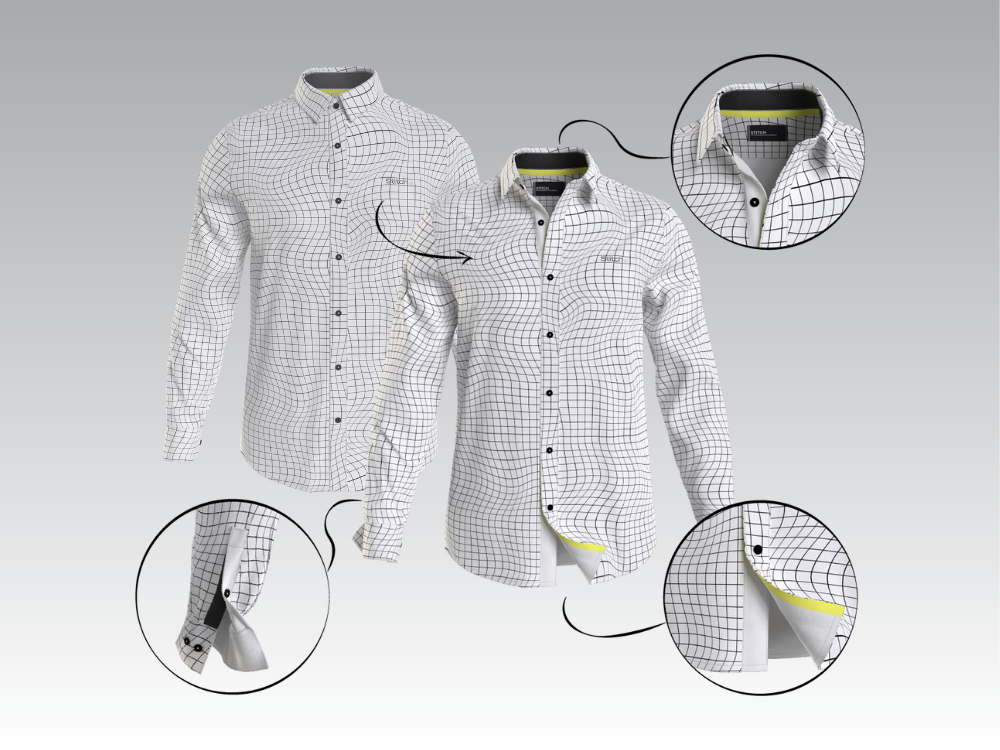
- Don’t be scarce on details. 3D Style Guides need to have as many details as possible. Provide thorough and visual information to ensure anyone can read it and understand it. This document needs to be easy to use for those creating the samples as well as for those providing feedback and requirements.
- Build the guide before proceeding to 3D sampling. Before you start melting down your computer with rendering (or not, if you’re using our Hub’s cloud rendering platform ;)) build a first version of the style guide so you can streamline the rendering process (e.g. rendering samples from the same category in one go). Don't worry if the first version is too simple: it's always good to start somewhere and iterate than have nothing and have to redo all your work.
- Update it often. This document should be reviewed at least once a year, and ideally once per season. Especially during the first seasons where you start scaling 3D, these documents should be at the center of any feedback sessions between teams. Keeping revisions is also very useful, as it can provide context to new team members on the steps leading to the most current styling choices.
- Create one guide per category. Every category is a world of its own and those differences need specific ways to highlight them in 3D. Logo placement, fabrication, or inside details can be vastly different whether you’re styling a pair of denim jeans or an outerwear piece. Make one style guide per product category and add the names of those responsible for making it at the start of the guide, so people know who to contact for questions or feedback.
